Branded Booking Page Example That Drives Appointments
A client finds your salon at 9:40 p.m., after the front desk has closed. They are ready to book a color service, but the first screen they see is a generic calendar with unclear service names and no sign that it belongs to your business. That is a missed opportunity. A strong branded booking page example shows how the right online experience can turn that moment of interest into a confirmed appointment, useful client data, and a smoother day for your team.
For appointment-driven businesses, a booking page is not simply a scheduling tool. It is a customer-facing part of your operation. It needs to reflect your business, answer practical questions quickly, and send accurate details into the systems your staff use to manage appointments, payments, and follow-up.
What a branded booking page should accomplish
A branded page gives clients confidence that they are booking with the right business. Your logo, business name, colors, service language, and policies create continuity between your website, social profiles, and the appointment itself. That consistency matters most when a new client is deciding whether to commit.
But appearance is only one part of the job. The page should also make the next action obvious: choose a service, select a staff member if appropriate, find a time, and confirm. Every extra question, vague label, or dead end can create hesitation. A good page removes uncertainty without overwhelming the client.
Behind the scenes, the booking should create a complete operational record. The appointment belongs on the right staff schedule, the client profile should capture relevant details, and payment or deposit rules should be applied consistently. If the booking page operates separately from your CRM and calendar, staff may still spend time re-entering information or resolving errors.
A branded booking page example for a growing salon
Imagine a salon called Studio North. It has six stylists, a mix of returning color clients and first-time haircut bookings, and a busy front desk that cannot answer every call during peak hours. Its booking page is designed around the decisions a client needs to make.
At the top, the page displays the Studio North logo, a short message - “Book your next salon visit” - and a clean, recognizable brand color. It does not lead with a long welcome paragraph. Clients who arrive ready to book should be able to start immediately.
The first choice is a service category: Haircuts, Color, Styling, and Treatments. Selecting Color opens a focused set of options, such as Root Touch-Up, Partial Highlights, Full Highlights, and Color Correction Consultation. Each service includes a short description, a starting price where useful, and an estimated duration. A client does not need to call just to ask what “color service” means.
Next, the page offers a stylist choice. A returning client can select their regular stylist. A new client can choose “First available” or review concise staff profiles showing specialties such as blonding, curly cuts, or lived-in color. This protects client preference while helping the salon fill available capacity.
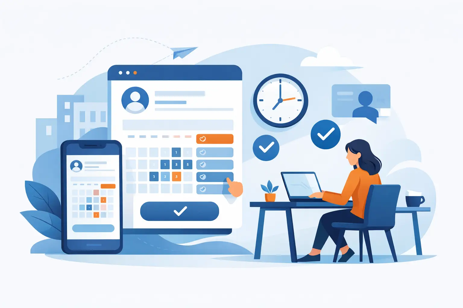
Once the client chooses a service and stylist, they see only the appointment times that actually work for that combination. There is no need for staff to call later and explain that a 60-minute slot cannot support a three-hour highlight service. The scheduling logic does the operational work before the booking is confirmed.
The final screen collects contact details, accepts a deposit when the salon requires one, and clearly displays the cancellation policy. After confirmation, the client receives an appointment message with the service, provider, date, time, and salon details. Studio North has gained more than a calendar entry. It has a client record that can support future reminders, campaigns, notes, and reporting.
Why this example works
The Studio North page works because it makes the client journey feel simple while preserving control for the business. The services are easy to understand, but they are structured well enough to protect staff time and scheduling capacity.
Clear service setup is especially valuable for salons, spas, and clinics with appointments that vary in length, price, preparation, or staff qualifications. A 30-minute brow service should not follow the same booking path as a 90-minute facial consultation. Likewise, a clinic may need intake questions or provider restrictions that a beauty studio does not.
Branding also has a practical revenue role. When a booking page looks like an extension of your business, clients are less likely to question whether they reached the correct provider or abandon the process to look elsewhere. For businesses that rely on social media and local search, that confidence can make a measurable difference.
Build the page around real booking decisions
The best booking pages are organized around how clients think, not around how your internal spreadsheet is arranged. Start with the few decisions clients must make before an appointment can be confirmed: service, provider or location, date and time, and any required payment or intake information.
Service names deserve more attention than many businesses give them. Internal shorthand may make sense to your team, but it can confuse first-time clients. “Signature Renewal” may sound appealing, yet it does not tell a client whether they are booking a facial, massage, or package. Pair branded service names with plain-language descriptions.
Pricing requires judgment. Starting prices can reduce unwanted inquiries and help clients arrive with realistic expectations. On the other hand, a fixed displayed price may not fit services that require a consultation or vary by hair length, treatment plan, or add-ons. In those cases, say so clearly and make the consultation path easy to book.
Your staff options should match your service model. Showing every staff member for every service may create errors. Limiting visibility based on qualifications, availability, and location prevents clients from booking an appointment your business cannot deliver. “First available” is also useful when speed matters more to the client than provider preference.
Add policies without adding friction
Deposits, cancellation windows, late-arrival terms, and preparation instructions protect your schedule. They should be visible at the right point in the booking flow, written in direct language, and consistently applied. Hiding a 24-hour cancellation policy in a footer creates more disputes, not more bookings.
There is a balance to strike. Asking for too much information before a client sees availability can cause abandonment. Asking for too little can leave your team unprepared. A massage practice may only need contact details and a brief preference at booking, while a clinic may need more detailed intake before the visit. Collect what is necessary for the appointment, then use post-booking forms or follow-up messages for the rest when appropriate.
Payment settings need the same consideration. A deposit can reduce no-shows for high-value or long appointments, but it can discourage a first-time booking if the policy feels unexplained. State the amount, whether it is applied to the service total, and the conditions for refunds or transfers.
Connect the booking page to daily operations
A polished page has limited value if it creates manual work after each booking. The real benefit comes when online appointments flow into one operating view alongside your customer records, staff schedules, payments, campaigns, and analytics.
For example, when a client books a facial, the team should be able to see their visit history, preferences, notes, and previous purchases without searching through separate tools. The provider should have the correct appointment duration. The business should be able to track whether that client returns, responds to a rebooking campaign, or becomes a regular customer.
This connection also improves decisions beyond the front desk. Booking data can show which services drive the most revenue, which staff schedules have unused capacity, and where cancellations are affecting performance. A branded booking page brings in the appointment. A connected platform helps you manage what happens next.
Review performance after launch
Do not treat your booking page as a one-time design project. Review it as an active part of your sales process. Look for services with frequent booking errors, pages where clients drop off, staff schedules that remain underused, and recurring questions that could be answered with better descriptions.
If clients repeatedly call to ask which service to choose, simplify the category names or add clearer guidance. If no-shows are concentrated in a specific appointment type, review reminder timing, deposits, and policy visibility. If a provider is regularly booked out while others have openings, adjust staff selection rules or use targeted campaigns to distribute demand.
CleverBooking helps bring those decisions into one dashboard, so the booking experience is connected to the operational data required to improve it.
A booking page should make your business easier to choose and easier to run. Build it with the same care you bring to the service itself, then let every confirmed appointment strengthen the client relationship and your control over the day ahead.